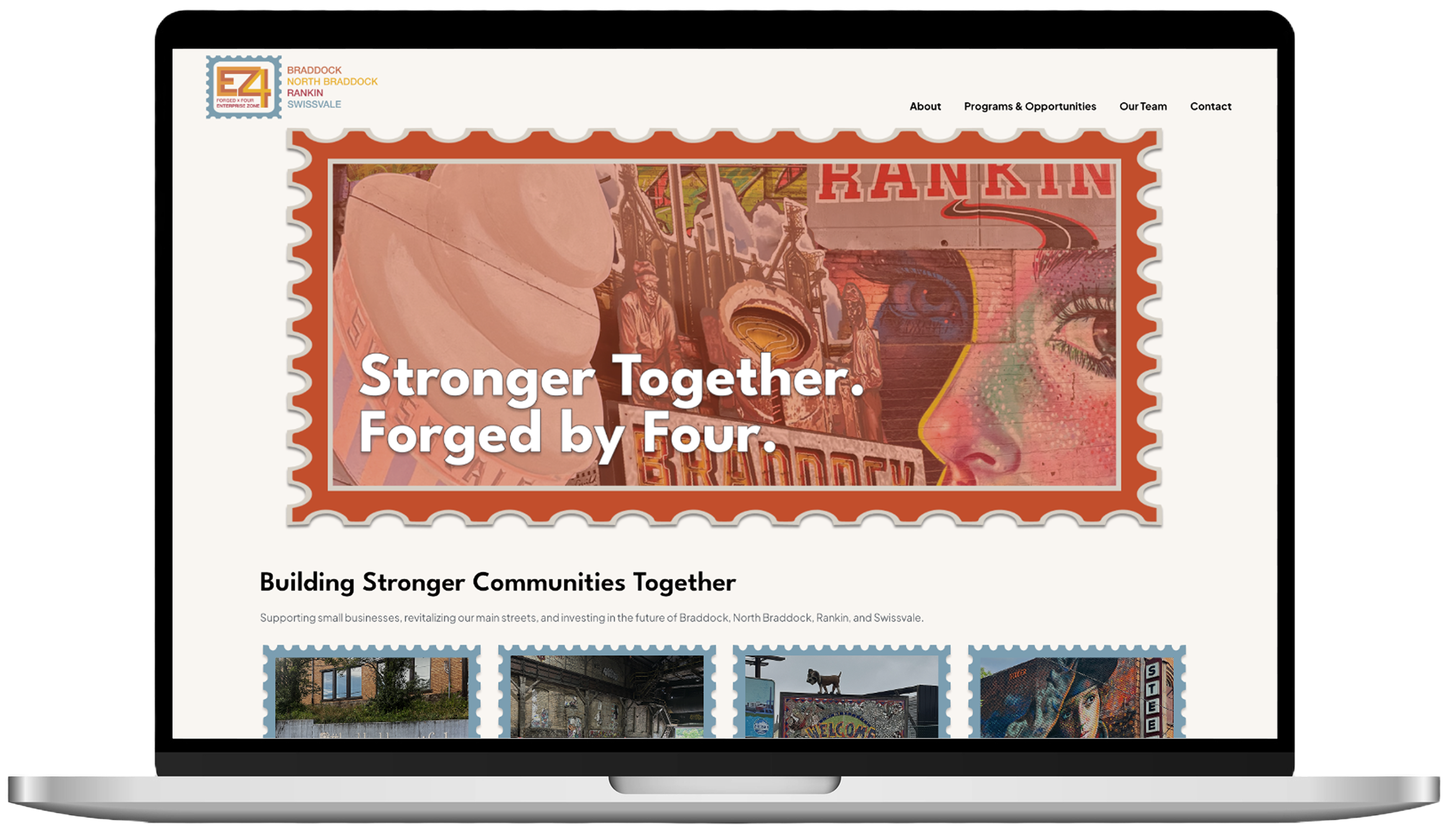
Logo with stylized letters 'EZ4' in orange and yellow inside a blue stamp-like border, with text 'FORGED x FOUR ENTERPRISE ZONE' below, framed by a decorative gold oval frame.

Forged X Four

The East Shore Braddock Corporation came to Fireman Creative with a clear need: their organization had outgrown its identity. As a non-profit dedicated to economic and business development across four Pittsburgh-area boroughs — Braddock, North Braddock, Rankin, and Swissvale — they needed a brand presence that could credibly represent their mission, unite their communities, and attract the partners and investment that would help those communities thrive. Over the course of one year, our team led a comprehensive rebrand from the ground up: a new name, a new visual identity, and a fully redesigned website built to carry that identity forward.

Key Contributions

Discovery & Community Engagement

Field visits across all four boroughs, community workshops, and stakeholder surveys to inform the rebrand strategy.

Brand Strategy and Naming

Renamed the organization Forged X Four — rooted in industrial heritage, uniting the four boroughs under one identity.

UX & Web Design

Wireframes to high-fidelity mockups in Figma, client presentations, and iterative feedback cycles through final approval.

Development & Launch

Full build plan, site development in WordPress and Elementor, launch, and ongoing maintenance and client updates.

The challenge

EZCB's existing brand struggled to communicate the breadth and ambition of the organization's work. The name itself felt bureaucratic, offering little sense of the rich history, resilience, or collective energy of the four boroughs it served. There was no cohesive visual language, and the website failed to tell a compelling story about the communities or the businesses within them.

Beyond aesthetics, the challenge was deeply human. Any rebrand of a community-serving non-profit carries real stakes. Residents and local stakeholders needed to feel seen and heard in the process, not presented with a finished product from the outside. The work required both strategic clarity and genuine community trust.

Process & approach

Discovery & Community Engagement

Our team made multiple field visits to all four boroughs, meeting with existing businesses, photographing the neighborhoods, and immersing ourselves in the character and culture of each community. We facilitated community workshops and developed surveys to gather direct feedback from residents and stakeholders on how they wanted their organization to be represented. This research phase ensured that creative decisions were grounded in the voices of the people the rebrand was meant to serve.

Interior of a large industrial building with graffiti-covered brick walls and rows of folding tables and chairs arranged on the concrete floor.

Naming & Identity Development

The organization was renamed Forged X Four — a name chosen for its strength and unity, nodding to the industrial heritage of the region while the "X" anchored the four boroughs as a single, interconnected force. The visual identity was built around a stamp motif, a deliberate nod to the boroughs' rich history and culture, giving the brand a sense of permanence and place. The system extended across logo design, print collateral including postcards, and a suite of digital design elements.

Logo with stylized letters E and 4 inside a blue stamp border, and text listing Braddock, North Braddock, Rankin, Swissvale.

UX & Web Design

UX and web design followed a structured, feedback-driven process. Working in Figma, I developed wireframes and high-fidelity mockups that translated the visual identity into a full website experience. Mockups were presented to the client in structured review sessions, with rounds of iteration based on their feedback. The photography from our borough visits brought the site to life, showcasing the charm and character of the communities in a way that no stock imagery could.

Website wireframes showing homepage, contact, about, programs, and memberships pages with a color palette on top.

Site Build & Launch

Development and launch was led by me using WordPress and Elementor. I created a detailed build plan before development began, ensuring the final site was faithful to the approved designs and maintainable by the client over time. The site launched on schedule and I continue to handle ongoing updates and maintenance for the organization. I also created training documents and tutorials for the clients to update and manage content on their site and led a training session with their team.

Laptop screen showing Forged by Four website with a mural background and text 'Stronger Together. Forged by Four.'

My specific role

While this was a team effort, my contributions spanned the full arc of the project. I participated in community field visits and helped facilitate the workshops and surveys that shaped the strategic foundation of the rebrand. In the design phase, I led the UX and web design process. I created Figma mockups, led client presentations, and drove the iterative feedback cycles that brought us to final approval. I then led the front-end build plan and developed the site in WordPress and Elementor, seeing the project through from concept to launch. Post-launch, I remain the primary point of contact for site upkeep and client-requested updates.

Visit fourgedxfour.org

Applications

Figma logo

Figma

Wordpress logo

WordPress

Elementor logo

Elementor